
Last March, the New York Times infographic with box office figures stretching back to 1986 won top honors at the Malofiej Awards, which decorate the best examples of data display. Click through the screenshot below to play with the graphic yourself -- in addition to showing a complicated data set in an intuitive way, it lets you get lost in movie memories.
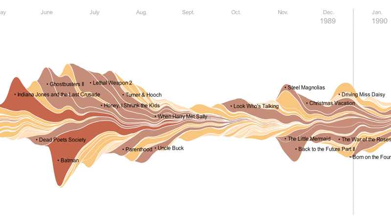 One thing that struck me about this graphic was how much larger the bumps are in recent years, as compared to the mid-1980s. Are people actually going to see more movies? Or are movie tickets just more expensive? Or were fewer movies distributed more widely in the past, meaning people attend more movies now?
 Here's a simple diagram of movie ticket price, adjusted for inflation (to 2008 dollars), over the same period as the New York Times infographic:

[Ticket price data from the National Association of Theater Owners, inflation adjustments from the Bureau of Labor Statistics.]
The National Association of Theater Owners is only estimated for 1989 and earlier, so those first few points are a little uncertain.
I squished the New York Times infographic to fit on the same scale in the background, so it's possible to compare ticket price and movie revenue directly. Just looking by eye, the movie revenue seems to be steadily increasing, while the movie ticket price goes from over $7 down to below $6 and then back up. So I'm inclined to believe that the movie ticket price doesn't account for the higher box office revenue in more recent years.
If you look closely at the graphic, the number of movies in theaters at a given time is higher after about 1998. Maybe people see more movies because there are more movies to see.
Yet to be investigated: the behavior of the U.S. population during this time period.
And as long as we're on the subject of movie revenue, here's a vote for keeping things in perspective regarding the box office prowess of Avatar: adjust for inflation, and Gone With the Wind is still tops, by a long shot.
![Reblog this post [with Zemanta]](http://img.zemanta.com/reblog_e.png?x-id=5425ecfa-c2a7-43fe-b789-ec82f0ce3a00)