
 I've been blogging of late over at Elucidata, on the Scienceline site. Most recently, I'm complaining about inflation. Again.
 Recently in Infographics Examples Category
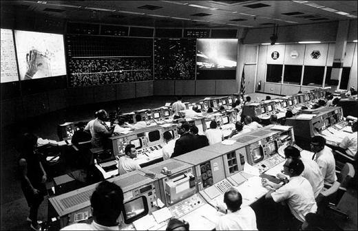
I've been blogging of late over at Elucidata, on the Scienceline site. Most recently, I'm complaining about inflation. Again. It may not be data visualization exactly, but it is visual, and it is cool. It’s footage of the Apollo 11 launch at 500 frames per second — twenty times the normal video frame rate. Pretty glorious.
Apollo 11 Saturn V Launch (HD) Camera E-8 from Mark Gray on Vimeo.
Occasionally I remember just how crazy it is that we sent humans to the moon. In 1969. With hard-wired, analog technology. Makes telling interactive stories on the iPad seem like a lark.
Over at the Tweed blog at the Chronicle of Higher Education (h/t Jane Lindholm), they posted this beautiful video of some magnificent art that‘s made with actual paper:
Rethink Scholarship at Langara 2010 Call for Entries from Rory O'Sullivan and Simon Bruyn on Vimeo.
Josh and I have been contemplating doing some real-life data visualization (with legos!) and capturing it on video. Stay tuned.
Just above the Best Buy in Union Square, giant digital numbers tick by. Behold:
Union Square Numbers from Katie Peek on Vimeo.
[Music by John Scott, freesound.org]
I walk past these numbers once a week, at least, and wonder. So I filmed them today, and then looked into what they are. Contrary to popular (read: my) belief, they do NOT display the national debt. They are, instead, an elaborate clock. An investigation into the nature of time, if you will. The piece is titled Metronome, by Kristin Jones and Andrew Ginzel, and it includes the other beautiful elements of the building face.
Reading from the left, the digits display the hours, minutes, seconds elapsed since midnight (6 digits). Reading from the right, they display the hours, minutes, seconds remaining before midnight (6 digits). And in the middle the numbers just scroll (3 digits). So I made my video at 18:15:18, when the time until midnight was 05:44:41. And indeed, the middle number runs so quickly it interacts weirdly with the frame rate of my camera and displays more than one number at once.
Pretty cool.
Today's infographic at Fast Company (where I clearly get all my blog post ideas) is about What Do You Suggest, a web site that beautifully and interactively allows visitors to explore the Google Suggest data.
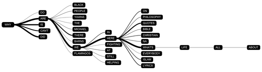
[Why are we here what's life all about, on WhatDoYouSuggest.net.]
I've been a little obsessed with Google Suggest for months, and now I may be obsessed with this site instead. What I love about What Do You Suggest is the additional information about the fraction of people who include each of the next words in their search — that information is sorely missing from the automatic suggestions that pop up when you're entering text in your web browser's search bar. My faith in humanity was a little bit restored to see that "why are we here" outranks "why are black people so loud," which was my most palm-to-forehead discovery of late. Though, I suppose, queries to the Internet about the meaning of life have their own set of problems.
Then again, maybe they're just Monty Python fans.
Today's interactive graphic by Amanda Cox on the New York Times Olympics page mixes sound with visuals extremely effectively.

The visual distribution of the finishing times is pretty effective on its own, showing how close athletes are when most aren't racing simultaneously. But when you click "play" and hear the little synthesizer piano tick off the finishes, you can suddenly imagine lugers sailing across the finish line — at 90 mph, no less — in rapid succession. The added sound really drives home the closeness of many of these races and makes the graphic much more effective.
Perhaps you, like I, have dutifully copied a serial number from a one dollar bill bearing a red stamp into the database at wheresgeorge.com. And perhaps you, like I, thought as you did so: "Surely nothing can ever come of this. How many people are actually as fastidious as I am, saving one particular bill in their wallet until they are reunited with the Internet?"
It turns out we were wrong. Something did come of it.
It's clear that this video was made by the scientists -- they don't shy away from using the jargon as a matter of principle. But it works. Because we're seeing the algorithms run as the narrator strings together words we don't understand, we're still able to get the essence of what they did. The video also has a strong voice and sense of humor, which sets it apart from many of the other, more educational winners.
I'm an astronomer by training, and I love me some physical sciences. But in this brave new science journalism world I've entered, I suddenly find myself encountering biology terms like "epigenetic" and "gene expression," and I haven't taken biology since 1995. So I was grateful to find the web site Learn.Genetics, from the University of Utah. It was featured in the 29 January issue of Science as the first of 12 winners in their now-annual online educational resources contest.

The cell scale featured above is cool, but then, I've always been a sucker for Powers of Ten-esque visualizations.
What I really needed help with, though, was epigenetics. My understanding was that different genes kinda turn on and off in different cells at different times, but what causes it and what the actual, observable effects are remained a mystery. So I explored the epigenetics section.
From the introductory video, I gleaned that genes are wrapped around proteins. From the interactive gene control graphic, I learned that more tightly wound gene-protein strands turn genes "off" and thus release fewer protein signals. The page on identical twins taught me that epigenetic markers change over our entire lives, and the story of the baby rat put everything together for me, actually showing the effect of epigenetic changes on the long-term behavior of an animal.
So the information is definitely here, though like most biology teaching tools, the dual hurdles of jargon and process prove formidable. It would be nice if the gene control graphic showed what happens further down the line than the protein release, but I was able to synthesize that with the baby rat story on my own. They do a nice job, and the visualizations are actually helpful. I certainly understand epigenetics better as a result.
Yesterday was the four month anniversary of the closing of the Mannahatta exhibit at the Museum of the City of New York. Do I sound like I'm in mourning? I miss it.
 [Credit: petit hibout, Flickr.com]
The exhibit deftly wove together three themes that have emerged in my own life and journalism: peeling back layers of history, a connection with nature in urban areas, and information display.
There's a nice description of the display space at the web site of Pentagram, the firm that designed the exhibit.
Conceived and executed by Eric Sanderson at the Wildlife Conservation Society, the premise of Mannahatta is to peel back New York's history layers to reveal the island as it was when Henry Hudson sailed into the estuary in 1609.
 [Credit: Sharon Hahn Darlin, Flickr.com]
I toured the exhibit on a rainy Friday afternoon last October, on its very last day.
At the center of the exhibit hall was a three-dimensional model of Manhattan island. Projectors above displayed maps onto the model, showing where streams once ran, where the Lenape camped, and where the beavers lived. And when I walked back across the northern reaches of Central Park, I could see it.
Maybe it's just because I live in the uplands of Morningside Heights, but I think the key to the success of that map was its three-dimensionality. The Mannahatta web site hosts an interactive version (more on that another time), but it's just not as evocative. On the model, I could imagine myself at the crest of Morningside Park, looking across open plains.
So many of our graphics are intended to be consumed on a flat surface. What becomes possible when we open up a third dimension? It's something I'm pondering.
Anyway. When I was at the museum, a tall man in a National Park Service uniform was taking measurements of the three-dimensional Mannahatta map, so I hold dear to the hope that it will resurface at some historic site someday soon.
Cracking locks, busting safes, heisting diamonds from high-security vaults — it's every little girl's dream.
A beautiful graphic promises to make those dreams come true. By the San Francisco designer Mark Campos, the illustration walks you through the technique for cracking a classic Master lock.
And today, I tried it.
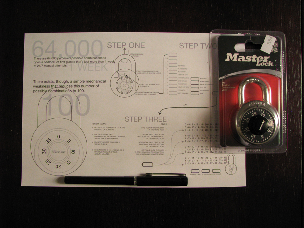
I carefully opened the lock packaging and removed the sticker from the back without looking at it. With no prior knowledge of the answer, I began my quest for the combination.
The first step has me pull up on the handle to feel for the last number. It was awfully satisfying to feel the mechanism catch at some numbers and not others. From the twelve places the dial catches, the graphic provides the algorithm for knowing which number is the final digit in the combination. Mine was nine. The diamonds are nearly within my grasp now.
With the last number known, it comes down to working through all the permutations. Fortunately, prior knowledge of how Master locks work means there are only 100 possible combinations. Around attempt 50 or so, things were looking pretty bleak. I thought I might be spinning that dial for the rest of my life. Then I remembered that a crack thief needs to focus! So I focused. And on attempt 74, it gave:
Cracking the Master Lock from Katie Peek on Vimeo.
Opening a lock whose combination I didn't know was damn cool. Even if someone else gave me the instructions.
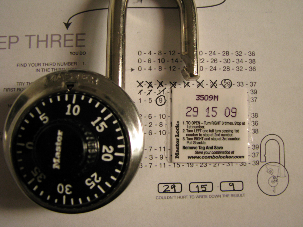
Beautiful infographic authenticated. Childhood dream accomplished. All in a day's work.
I'm a regular Parker.